Another update for matrixread, this one’s more of a UI update than a technical one. I wasn’t quite satisfied with the previous design I made and then started working on this new concept. This design follows almost the same style as the previous one but with some extra focus on minimalism and a pinch of material design here and there.
A Minimalist Footer
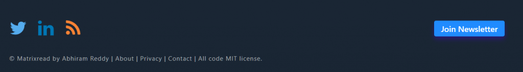
I’ve removed all inactive social links and re-ordered all the links below. As there isn’t much I want to tell here except for my Newsletter I kind of highlighted also notice the light glow effect around the button.
Scrollbar + Reading Progress Bar
I found out that having a gradient scrollbar or anything too fancy might affect the accessibility of the page hence, I just added some color to the scrollbar. It also has some pop-colored thumb, this way the scrollbar also adds up as a reading progress bar as I have no bloat at the end of the article or footer.
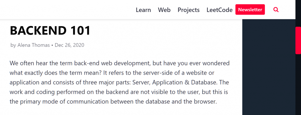
Simple Header
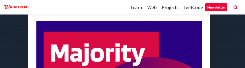
The header is sticky like always with simple navigation to different topics on the blog and a search icon. And one button to the matrixread newsletter feed.
Cute Scroll-to-top
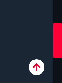
This was a new feature on both mobile and desktop views to help users navigate easily to the top of the page or article.
Material buttons
All the buttons have smooth corners with the help of
border-radius: 4px;Code language: CSS (css)On the Backend
There were a lot of optimizations done on the backend, I have also reduced my plugin count from 20 to 🥳14. The admin dashboard loads much faster now.
Check out the whole version history of Matrixread at version log.