In November 2016, Google announced mobile first indexing will also be considered i.e till then only the desktop version of a website is used for ranking but with the new changes the mobile version of your page will also determine your rank and if you don’t have a responsive or a proper mobile friendly version of your site it will sink your Google ranking overall and thats not so good as the desktop version is not optimized for mobile often with poor performance metrics.
Google update – March 2020
Yes, again Google updated on March 05, 2020, that from September 2020 they’re gonna start and consider mobile-first indexing, they also mentioned that 70% of the websites are already compatible, and the crawling is being performed by smartphone Googlebot in a post at Webmaster Central Blog.
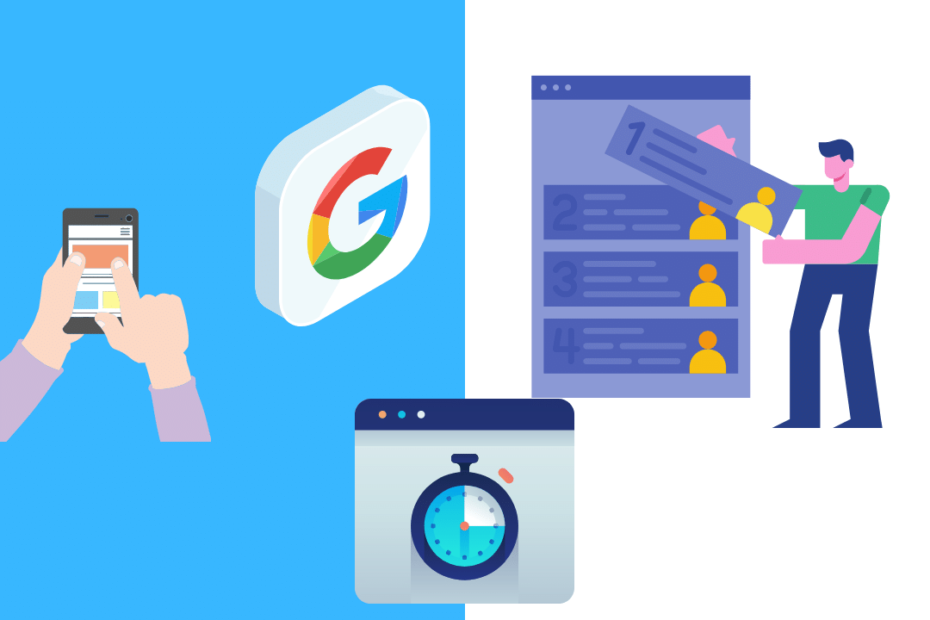
Important factors affecting mobile ranking
Mobile version is not just a responsive version of your site
There are a lot of factors to consider when dealing with the mobile version, we’ll discuss some that have a direct impact on ranking
- Speed, yes usually web pages aren’t rendered as fast and easy on a mobile compared to the desktop so before you add too many scripts, just remember they have a huge impact on loading time and some scripts just block the view further degrading the loading speed.
- Sitemap, you must ensure that sitemaps are easily accessible even on the mobile version.
- Choose a Responsive design and theme to support a wide range of devices like mobile, tablet, smart displays.
- Avoid pop-ups, they’re already annoying on the desktop version, try not to use them as far as possible because the screen size is too small for distractions and unwanted clicks.
- Media like photos and videos should be compressed and optimized using web-friendly formats like [.webp] and lazy loading to avoid render blocking.
- Metadata and Opengraphs tags for Twitter and Facebook should be included and optimized for mobile.
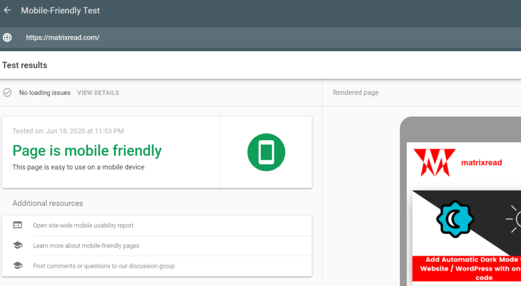
1. Mobile friendly test by Google
This is a free tool that checks whether your site is mobile-friendly using Googlebot smartphone and this can give you insights on how far your site is responsive and other problems on the mobile version. Test your site now at
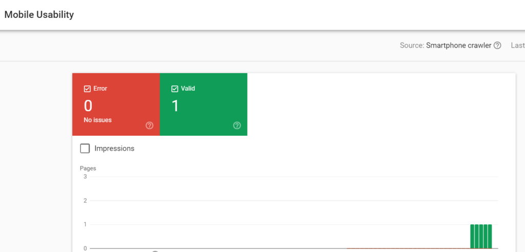
2. Mobile usability report for already existing pages
If you already have a responsive theme and further if any of your pages or parts of the website are having trouble or showing up errors, they can easily be tracked using the search console. The main advantage of this report is that it shows all the stats like date, Google search updates with issues, errors, and valid pages. Verify at
3. Performance Test – Pagespeed Insights
This is very important and might be the final test to check whether your site is mobile friendly as the loading speed, blocking time, rendering and FCP (First Painful Content) are shown and the best part is that it also suggests recommended actions to improve the overall score. The score usually means the following,
- 90-100, You’re already doing good, further improvement can be done at ease.
- 50-89, Needs to be fixed, analyze the report with contents affecting and start fixing them.
- 0-49, This definitely means poor performance on mobile consult a web-developer or update your team regarding this and start working on it right away.
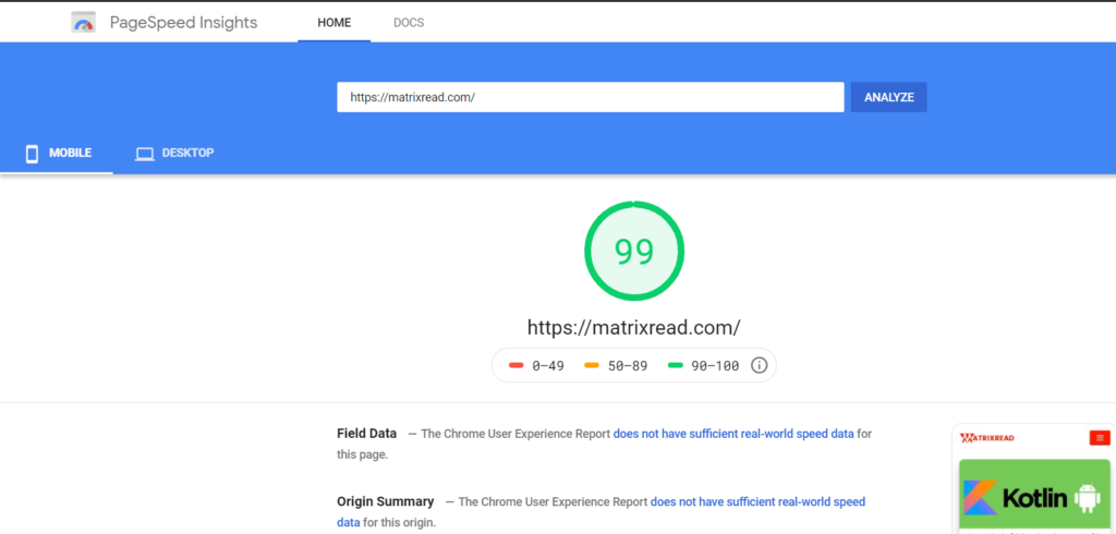
Go through the report thoroughly as it shows everything slowing down your website on mobile and insights and documentation on how to fix them, I have used it and found it very useful to pin-point the exact element to be fixed. Here’s the link to test
Don’t forget to switch to the mobile report as it shows both the reports of mobile and desktop.
Start Thinking mobile-first
Its no surprise why Google wants pages to load faster on mobile, with the increasing searches and high-conversion rates show that most people buy things, read, and watch for more time on mobile devices compared to desktop and this number is increasing at a rapid rate hence think mobile first for the future.
Resources
Conclusion
If the results are not good, don’t panic as it won’t help. First, analyze what’s to be fixed and then start working. And it’s never too late at least now you found out and fixing things will definitely result in a good ranking at least in the near future.