The web must be accessible for everyone, and the color combinations we chose affect the accessibility directly. Color of the text, background, buttons, forms almost everything can tamper the readability and visibility. And, there are a lot of perks with using accessible colors, as they decrease the cognitive load i.e the user’s ability to process information and make the right decisions. For example, we’ve seen buttons like delete/cancel associated with the red color, here the color briefly describes the nature of the operation.
WCAG Standards
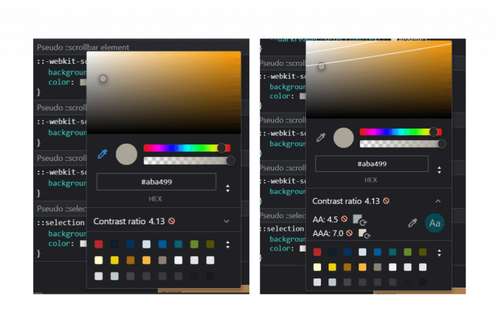
WCAG (Web Content Accessibility Guidelines) sets the standards to make the web accessible for everyone and there are three levels by which quality and compliance can be measured. The levels are A, AA, and AAA. Level A is basic and minimum. Now, we want to be at the level AA, there must be enough contrast between the colors. AAA is much better and for that, we must use very high contrast and dark colors. So, remember AA and above.
Chrome Color Picker to the Rescue
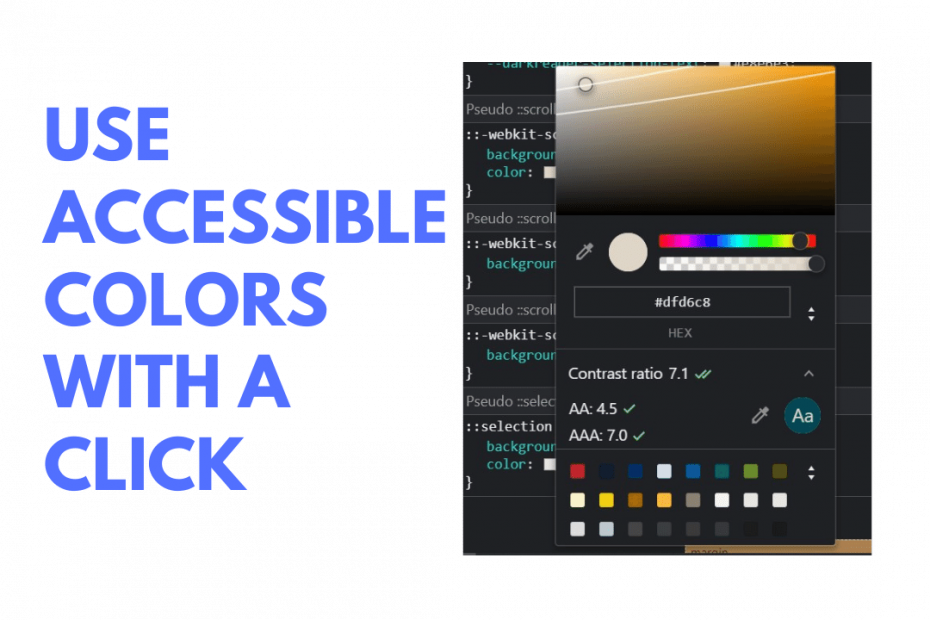
A while ago when I was tweaking my blog to hit a 100 on Lighthouse for accessibility, I found out that the Chrome color picker suggests a suitable color automatically based on the component’s background color. The best part about this is that you are getting the closest color to the existing one, that complies with AA or AAA standards.
Steps to pick an accessible color
- Open Chrome Developer tools
- Inspect the CSS of the required element
- Click on the color property
- Expand the contrast ratio property
- Chose suggested AA or AAA color, that’s it we’re done.
📝 Note: As per Google’s web.dev blog, this feature is experimental. However, it does fix most of the issues and really handy when you need a quick fix.
A simple trick I use to fix anything
This works for buttons, text, and many common element styles. But in some cases, we might want the color to remain constant like the white text color for buttons and we are ready to alter the background. In that case, just swap the text color and background color of the button and Chrome magically suggests a new accessible color based on the given color combination.
More on Colors and Accessibility
Refer to WCAG Guidelines for more best practices. There is also a special tool called a color contrast checker that accurately calculates the contrast ratio for the given color combination.
So, is your site accessible for all?