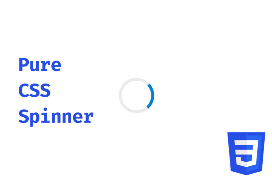
I had to use a loading animation in one of my mini-projects and I thought of creating a simple CSS spinner, no npm, no JavaScript, nothing. The spinner looks similar to Microsoft and HP apps with this blue loading animation.
Let’s see the code
HTML
<body>
  <div class="spinner">
  </div>
</body>Code language: HTML, XML (xml)
CSS
body {
  margin: 0;
  padding: 0;
  height: 100vh;
  display: grid;
  place-items: center;
}

.spinner {
  width: 40px;
  height: 40px;
  border-radius: 50%;
  border: 4px solid #ebebeb;
  border-top: 4px solid #007dd7;
  animation: 2s spin linear infinite;
}

@keyframes spin {
  0% {
    transform: rotate(0deg);
  }
  100% {
    transform: rotate(360deg);
  }
}Code language: CSS (css)
Explanation
As for the HTML, we need a single div for the spinner, and for the CSS, I have used a grid in the body to center the div. Then added colors and borders for the spinner. Defined the keyframes, the keyframes start from 0 to 360 like a circle.
The animation code is a one-liner but can also be written below. We can also tweak these properties like the duration, and count for variations.
.spinner {
  animation-duration: 2s;
  animation-name: spin;
  animation-timing-function: linear;
  animation-iteration-count: infinite;
}Code language: CSS (css)