Buttons play an important role everywhere. As a developer it is our duty to create buttons that have a clear purpose and do what they’re supposed to do. The user should know where to click and what happens next.
Buttons in HTML
<button>Click Me</button>Code language: HTML, XML (xml)Button using Anchor tags
<a>Click Me</a>Code language: HTML, XML (xml)Without styling
Click Me
With styling, gradients will look great.
Image as a Button
We can also use images, SVG, icons etc as a button in some cases, SVG and icons are make really beautiful buttons.
A button can be anything
A button doesn’t have to be rectangular, there are many ways to create a button, like using the toggle buttons, check boxes, etc.
Don’t make boring buttons
We want our users to click more and enjoy our app/website. Some buttons are very very important, like
- BUY
- CALL
- FOLLOW
- SUBSCRIBE
- ADD TO CART
The above buttons are also known as CTAs (Call To Actions), where our goal is to prompt the user to click them.
Now, what happens if the user doesn’t find these buttons interesting? or sometimes really can’t see these buttons? everything is wasted.
Hence, it is our job to ensure the user knows where and what to click.
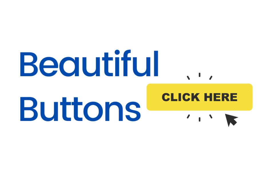
Creating Beautiful Buttons
There are many ways to style and decorate buttons in CSS using hover effects and animations but, here I’ll discuss some tricks I know.
1. Use Contrast Colors for Buttons
A button should be attractive, grab attention from the user to click it, like the like and subscribe buttons.

I made this for a sidebar, whenever the user reads the heading and other content, they know where to click and join immediately without a doubt if they are really interested. Careful with the colors too, do not create too dark or reddish buttons unless the theme and color matches our brand and intentions of the button’s action.
2. User Satisfaction
Make sure the button works and it does what it says, often we see some buttons and actions are misleading, especially when buying products, if we do so, this creates a bad impression and the user will never use our website/app. Thought of popups?
3. Don’t push
Okay, you created a beautiful subscribe button, now don’t start popping it on the user until they click it. That’s really bad and users either block it or leave the page.
4. Too many can be a distraction
We need to be very careful about highlighting buttons and CTAs as having too many may result in zero clicks 😱. Yes too many colorful buttons might confuse the user, may end up in either clicking the wrong button or nothing.
Between Like, Share and Subscribe, we choose to highlight subscribe, as simple as that.
Conclusion
Creating beautiful buttons results in wonderful results and the best user experiences. Quality over Quantity, the less the better and more clicks.